16 Surprising Secrets Behind Disney's Architecture
When you think of Disney resorts, architecture might not be the first thing that comes to mind. However, in these hyper-detailed fantasy lands — and other constructions associated with The Walt Disney Company — architecture plays a more important role than you might expect.
Here, you'll find 16 secrets behind Disney architecture you probably didn't know about.
1. Some Disney buildings are "invisible."
Disney invented two paint colors — Go Away Green and Blending Blue — that are specifically designed to be ignored by the human eye, allowing unsightly "backstage" buildings to blend into the background. The paint colors are even used to hide things like garbage cans and speakers.
2. Nothing is as big as it seems.
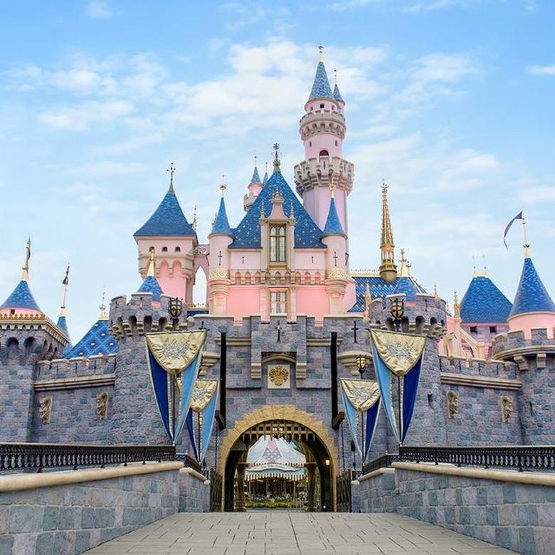
Disney theme parks are notorious for their use of forced perspective, which uses tricks like scale and angles to make buildings seem larger (or smaller) than they actually are. For example, on some of the castles (like Sleeping Beauty Castle in Disneyland), the bricks near the top of the building are smaller than the ones at the bottom to create the illusion that the castles are taller than they are in reality.
3. Main Street, U.S.A., was modeled after an actual small town.
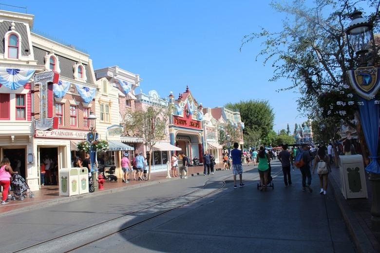
Many believe that Main Street, U.S.A. — the themed street at the entrance of the Disney theme parks — was inspired by Walt Disney's hometown of Marceline, Missouri. However, while Marceline did influence Disney's original design for the park, the actual Main Street, U.S.A., was modeled after Imagineer Harper Goff's hometown of Fort Collins, Colorado.
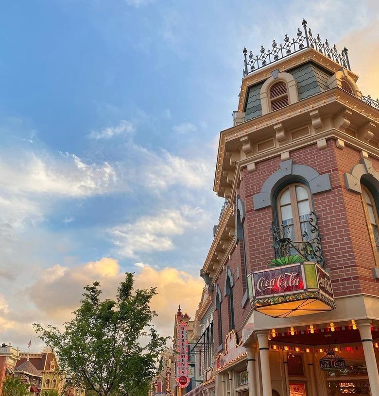
Main Street is also another area of the park that utilizes forced perspective to appear larger than it actually is. There, in Disneyland specifically, you will find buildings that pay homage to American turn-of-the-20th-century design with their varying heights, different exterior colors, gingerbread roofs, Victorian ironwork, and signs surrounded by lights. In Walt Disney World, on the other hand, you can spot more East Coast influences like roofs of a similar height and more neutral color choices.
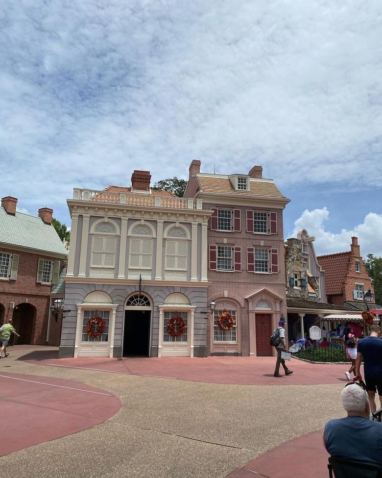
4. Magic Kingdom's Liberty Square has unusual period-accurate details you might never have noticed.
Next time you're walking around the Americana-themed land that is Liberty Square, take a look at the shutters on the houses. See how they're crooked? That's intentional. During the colonial era, shutters were often hung with leather straps — they stretched over time, creating the wonky look.
There's also another period-accurate detail in Liberty Square. That brownish path that runs down the middle of the street is designed to represent the sewage rivers that actually flowed down colonial-era streets. Indoor plumbing didn't exist at the time, so people simply tossed their waste into the street. Gross! (That's also why there are no bathrooms in Liberty Square — Walt Disney was a big stickler for details.)
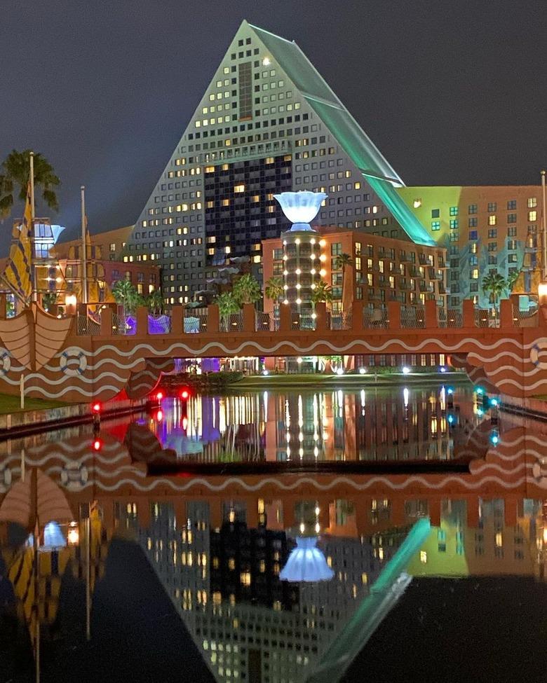
5. The Walt Disney Company really loves postmodernism.
Celebration wasn't the only place where Disney invested in postmodern architecture, a highly controversial style criticized for its inconsistency and views on rationality. The company thrived on it. From its headquarters in both Orlando and Burbank, California (designed by Michael Graves and Pritzker Architecture Prize–winner Arata Isozaki, respectively) to the Walt Disney World Swan and Dolphin resort (more of Graves' work), the design style is everywhere.
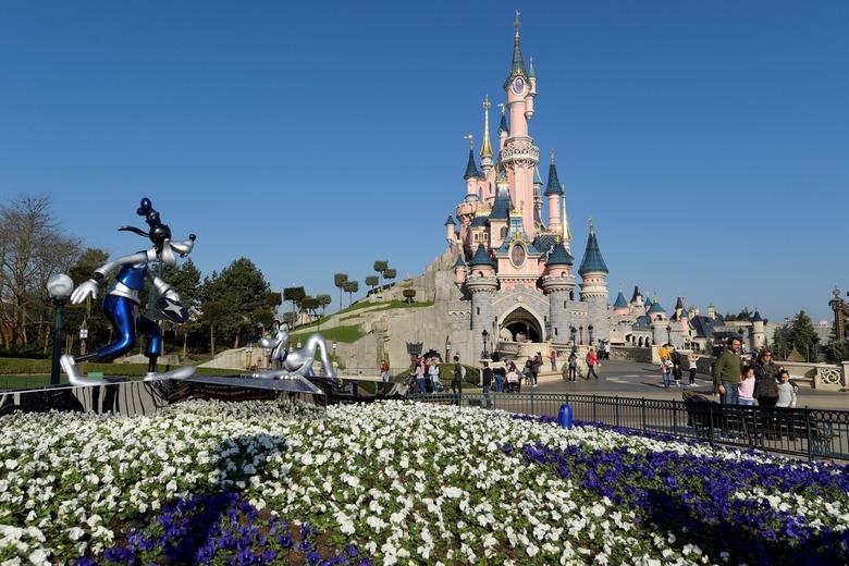
6. The castle at Disneyland Paris has multiple nods to French architectural icons.
The exterior of Disneyland Paris' Sleeping Beauty Castle is largely inspired by the island Mont-Saint-Michel in Normandy, known for its monumental hilltop abbey (and the road to it that disappears at high tide). Inside, the gothic design is drawn from the Sainte-Chapelle chapel in Paris, an architectural marvel with breathtaking stained glass windows.
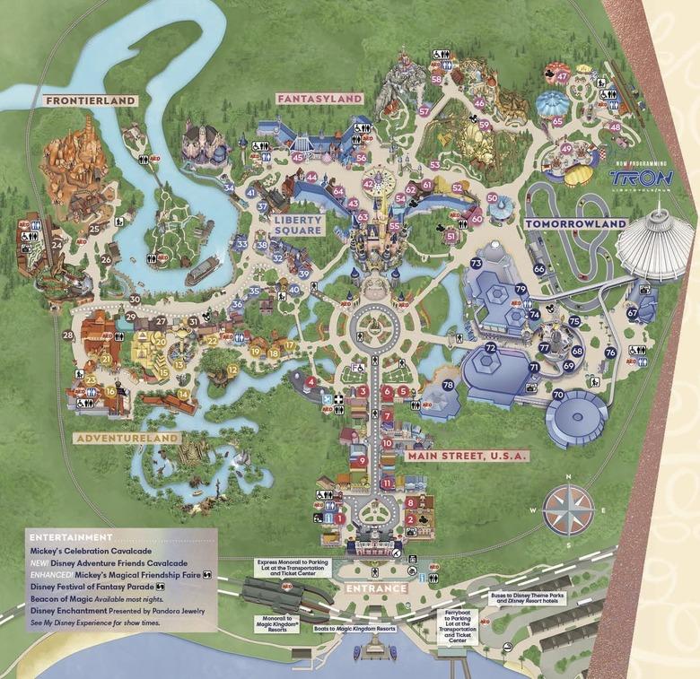
7. At Magic Kingdom, you can't see one land from another.
The themed lands at Magic Kingdom might be right next to each other, but you wouldn't be able to tell from looking around. Disney Imagineers cleverly designed the park so that you can't see any of the buildings or attractions from one land while standing in another, using things like trees and architecture as barriers.
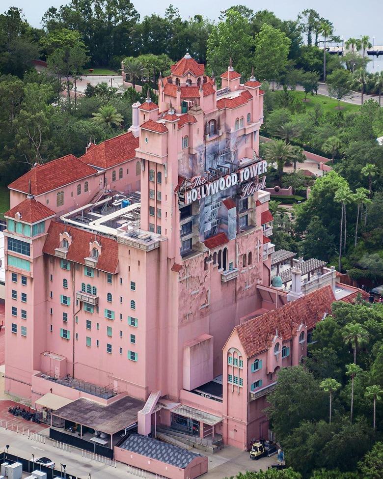
8. There's a very specific reason the Tower of Terror has Moorish-inspired architecture.
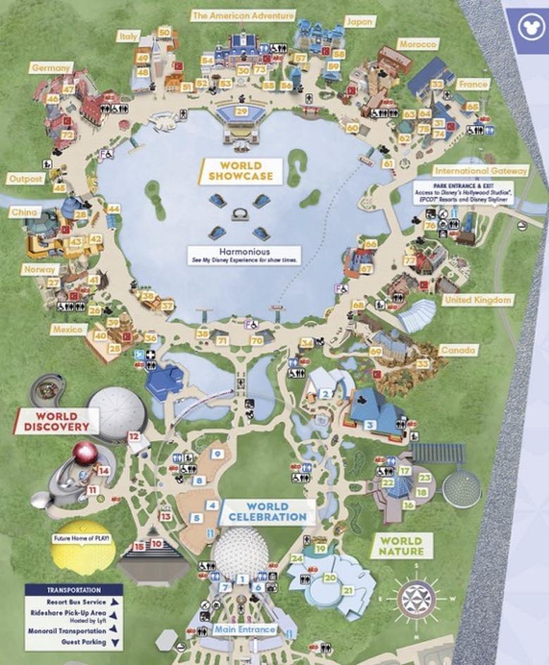
There is one place in Walt Disney World where there's an inter-park crossover. Because Hollywood Studio's The Twilight Zone Tower of Terror is visible from EPCOT's Morocco pavilion, it's designed with Moorish flair to blend in with the architectural theme.
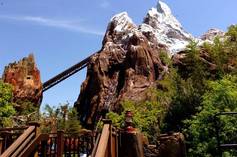
9. Why Expedition Everest at Animal Kingdom is exactly 199.5 feet tall.
Expedition Everest is Walt Disney World's tallest ride at 199.5 feet (beating out The Twilight Zone Tower of Terror by just six inches). Why that specific height? If it were 200 feet tall, it would have to have a flashing red light on top to warn aircraft of its presence, per Federal Aviation Administration (FAA) regulations. Disney didn't want that light to ruin the atmosphere of the ride and its mountainous home, so they built it to a height just beneath that benchmark.
10. There's an entire world under your feet at Walt Disney World's Magic Kingdom.
When you walk the streets and pathways of Magic Kingdom in Orlando, you're actually on the second floor of the theme park. The ground floor is a massive series of "utilidors," or utility corridors, that allow many of the park's operations to go on behind the scenes. Cast members can use the utilidors to get from one part of the park to another, while high-speed, vacuum-powered trash chutes whisk garbage away to a compactor at 60 miles per hour.
11. There really are secret rooms throughout the parks — and some members of the public can get inside.
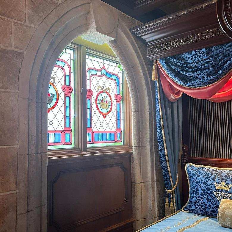
For starters, there's the 21 Royal restaurant at Disneyland, housed in a space originally designed by Walt Disney as his family's private residence; members of the public are able to make reservations. Then there's Club 33, a membership-only dining club with private venues at a number of Disney parks. And finally, there's the infamous Cinderella Castle Suite, housed in Magic Kingdom's Cinderella Castle, of course — you can't book a stay there, but you can win one through Disney-hosted contests.
12. EPCOT was originally supposed to be a real city, not a theme park.
When Walt Disney himself conceived of EPCOT, he wasn't thinking of making a theme park — he really wanted to create a utopian city. EPCOT stands for the Experimental Prototype Community of Tomorrow, which is exactly what Disney hoped to create. Sadly, he died before the concept came to fruition, and the idea was eventually turned into a theme park that celebrates technology and advancement.
13. But the Walt Disney Company did develop a suburban master-planned community in Orlando outside of the parks.
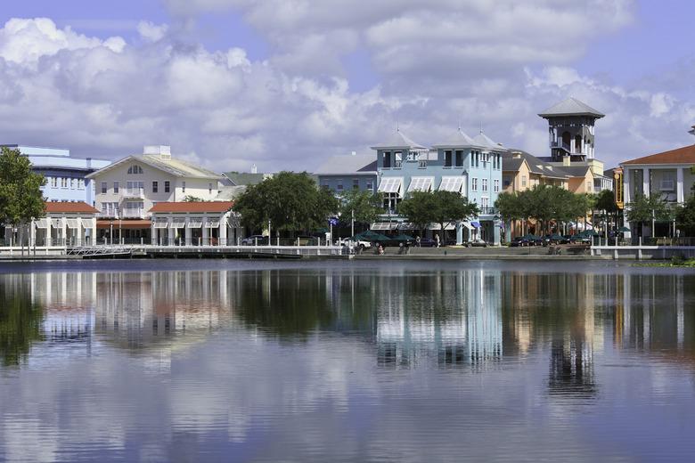
Though Walt Disney was never able to design his own city, his company did. The community of Celebration, Florida, which has a population of about 11,000 people, was developed by the Disney company during the 1990s in the spirit of New Urbanism. Interestingly, it doesn't have any sort of Disney theme to it (in fact, Disney sold off the project in 2004). The CEO of Disney at the time, Michael Eisner, was a fan of hiring "starchitects" for his projects; you'll find buildings by Robert A.M. Stern, Philip Johnson, Cesar Pelli, Michael Graves, and Robert Venturi and Denise Scott Brown here.
And now, we have Cotino, a "Storyliving by Disney" community.
14. Each theme park's castle is Instagram-ready in terms of lighting.
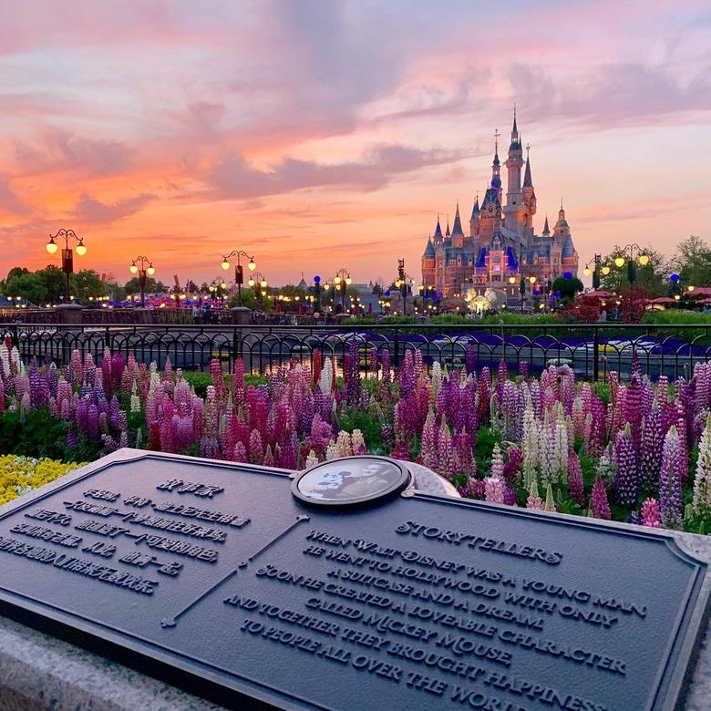
The six Disney castles — in Orlando, Anaheim, Hong Kong, Shanghai, Tokyo, and Paris, in case you were wondering — were all built facing south. That ensures that they're never backlit by the sun, guaranteeing great lighting for anyone photographing them from the front.
15. Hong Kong's castle was the first to be completely redesigned.
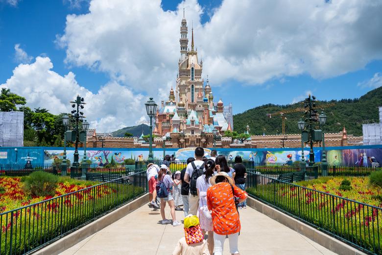
For the Hong Kong theme park's 15th anniversary, it debuted a completely renovated castle: The Castle of Magical Dreams. It's not dedicated to a single princess, instead honoring many of Disney's princesses across its 13 towers, turrets, and spires. Even some of the newer princesses made the list, including Tiana from The Princess and the Frog, and Elsa and Anna from Frozen.
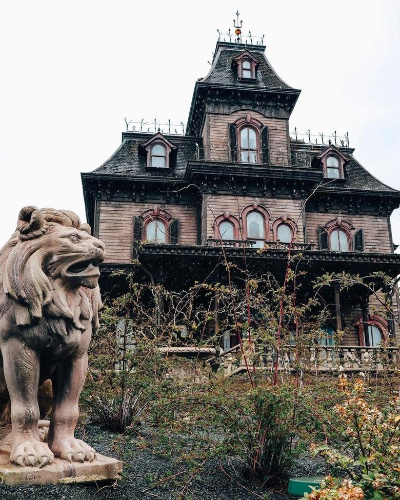
16. The Haunted Mansion has different architectural styles in different parks.
It's not only the castles that differ across Disney theme parks. The iconic Haunted Mansion ride also boasts different architectural styles in different locations. The original ride at Disneyland draws from Southern architecture, while the rides in Orlando and Tokyo have an East Coast Gothic style. The Paris ride, which is called Phantom Manor, riffs on Old West architecture, while the Hong Kong edition, known as Mystic Manor, displays classic Queen Anne style.
