The Untold History Of The Iconic Wallpaper In Disneyland's Haunted Mansion
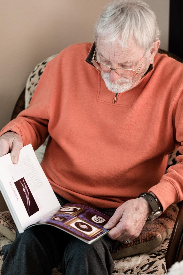
If you really want to know the story of the Haunted Mansion's wallpaper, you need to take a trip to Oceanside, California, where the man who created it lives. His name is Rolly Crump — yes, really — and even he didn't know at first that he deserved credit for the now-famous design.
"When someone told me that they liked the designs I did for the wallpaper, I said, 'What designs? What wallpaper?'" the octogenarian Imagineer recalls. "I didn't know what the hell they were talking about."
But to get to that point in the story, we have to go back.
Since opening its doors in 1969, 14 years after Disneyland began welcoming visitors, the Haunted Mansion has become a topic of fascination for fans of old-school Disney facts and lore. There are the urban legends, of course (that the house is haunted by real ghosts), but it's the insane attention to detail — "999 happy haunts," to be exact — that makes it one of the most immersive and transporting experiences in amusement park history. It's also one of the last things Walt Disney worked on before he died, so for some, it represents a final connection to his creative spirit.
(Image: Haunted Mansion postcard circa 1978 courtesy MetaGrrrl/Flickr Creative Commons)
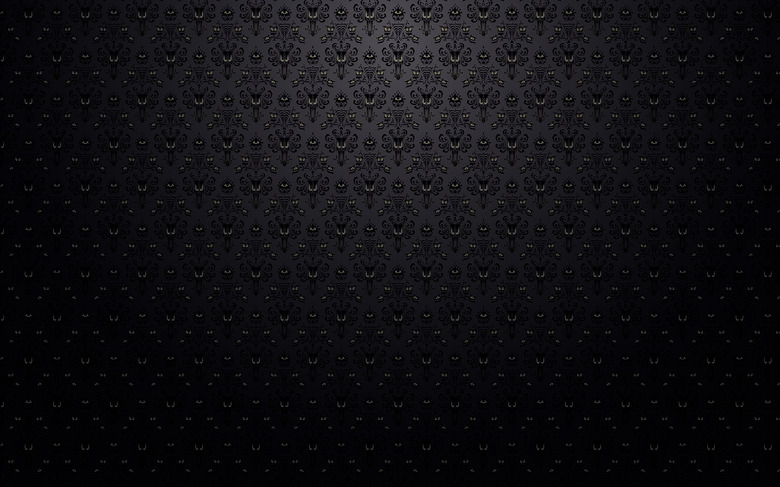
But of all the Haunted Mansion's details, only the black-and-purple wallpaper — which at first appears to be simply an oversize damask, but upon closer look is revealed to comprise creepy clusters of eyes — has attained true cult status. Guillermo del Toro reportedly has a reproduction in his home; Etsy offers everything from phone cases to umbrellas sporting versions of the print. "It's really become a symbol of the Mansion," says Jason Surrell, author of The Haunted Mansion: Imagineering a Disney Classic, and a former senior show writer for Walt Disney Imagineering. Most people gravitate toward it, he believes, because the design is "striking, iconic in its own right." But for a certain subset, it represents something else: "The wallpaper, it's one of those subtle things. It's a way you can subtly express your fandom ... it's like a secret code for coolness," he explains.
But for all the infatuation surrounding the wallpaper, its origins remain relatively unexplored. Many credit Marc Davis — one of the Imagineers who worked on the Haunted Mansion — as its maker. That's not the case — which brings us back to Rolly Crump. Crump, now in his late eighties, is the last remaining designer who worked on the ride. He lives in a modest condo in Oceanside that doesn't fully reflect his colorful career or his star status among worshippers of the Church of Disney. Only a few of his illustrations line his home's walls; he sold almost all of his expansive collection of art and memorabilia in a 2018 auction.
Crump's artistic style is distinctive: it can sometimes feel like a midcentury-circus-Tiki dream with lots of detailed embellishments, elongated figures, and a tendency to embrace the off-kilter, the taboo, the weird. It's what first caught Disney's attention when he saw Crump's work in the company's Animation department.
"I had had a show in the library at the Disney studio and that show was marijuana posters," Crump remembers. The illustrations on display there were like old-timey advertisements for pot — one read "imported by Stoned and Co." When he heard that Disney himself had wandered into his gallery, Crump panicked. "Oh my god ... did he read the posters?" he wondered. "Yes," said the woman running the library. "And he laughed!"
Crump's transition from Animation to WED (the branch that would ultimately become Imagineering) happened quickly, and in 1959, he was brought in to work on the Haunted Mansion, which had already been in development for at least two years.
"The wallpaper, it's one of those subtle things. It's a way you can subtly express your fandom ... it's like a secret code for coolness." — Jason Surrell
But what that meant at the time wasn't quite clear. "They decided to put Yale Gracie, who was a background illustrator, and I, together in a big room up at the studio to work on the Mansion. And so Yale and I sat up there and I said, 'Well, what do we do?' and Yale said, 'Well, I dunno!' Because there was no given thing to do. It was just: 'Work on some stuff for the Mansion.'"
Ultimately, there was a point of disagreement among the team. "At that time," says Crump, "a lot of different people started getting involved with [the development] — the architecture, the look, the interiors." In one camp were the Imagineers who wanted the ride to be fun. In the other were those looking to create a scary experience. Crump was firmly seated in the latter.
He started doing random sketches, taking inspiration from the 1946 French movie, Beauty and the Beast. "I fell in love with that film because they had human parts in the rooms ... there would be these human arms [acting as] torches. I thought, 'Shit that's good stuff,' because it was imaginative and surreal, and so I started leaning in that direction."
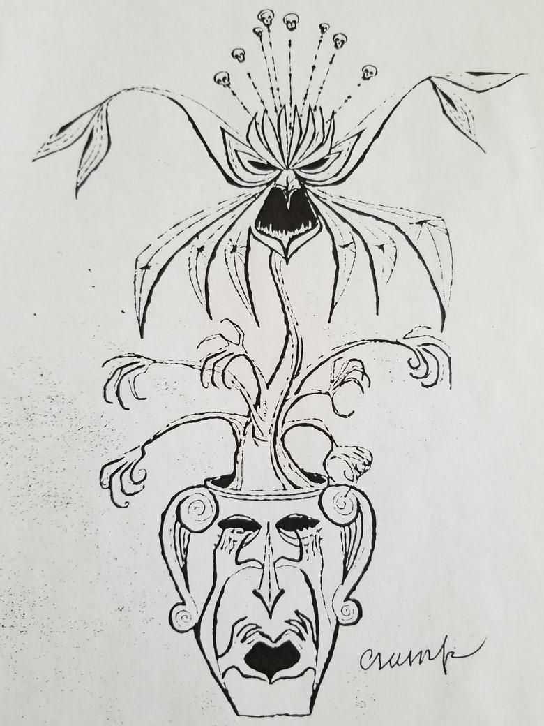
(Images: Left, Plant Man illustration, courtesy Rolly Crump; right, Mansion wallpaper, courtesy ste3ve/Flickr Creative Commons)
These drawings — of things like a melty-looking man whose arms were candelabra, a gypsy wagon, a man-eating plant — led to a concept that was never realized: the Museum of the Weird. It was to be a transitional space at the ride's exit featuring Crump's illusions and creations, an idea, he says, he can't take credit for. That was all Disney: "You know, Walt always took everything we did to the next level. Nobody really realizes that Walt was really behind damn near everything we did. Once he got a kind of inkling of the project we were working on, he immediately saw it finished. So as we were starting to execute it, all of a sudden you realize, well, he knew what the hell we were doing."
At the time of Disney's death in 1966, two designers, Claude Coats and Marc Davis, were working on completing the Mansion. Over the years and leading up to the attraction's opening, the team was pulling inspiration for the look of the house from a book by Frances Lichten called Decorative Art of Victoria's Era, and as you flip through the pages, you see how the book directly impacted the Mansion's design. For starters, in a section on cast iron motifs, there's a picture of the Shipley-Lydecker house, which the team replicated with frightening exactness. (The original home in Baltimore is no longer standing, in case you're wondering.) Lichten's book also features multiple examples of rooms with damask prints and wallpapers.
When the team finally got around to creating a wallpaper for that section of the ride, Coats worked off of an illustration Crump had done for the Museum of the Weird — what Crump calls the "plant man" — and positioned it in a pattern that feels very directly inspired by Victorian-era damask. "What Claude had done was found all my sketches and traced them. And made wallpaper out of them," says Crump.
"Walt always took everything we did to the next level. Nobody really realizes that Walt was really behind damn near everything we did. Once he got a kind of inkling of the project we were working on, he immediately saw it finished. So as we were starting to execute it, all of a sudden you realize, well, he knew what the hell we were doing." — Rolly Crump
Was he angry about his designs being repurposed? No. "That type of thing happened all the time. I did the original paintings in the stretch elevator and Marc [Davis] came to me one day and said, 'I'm going to redo those stretch paintings, yours were no good.' At that time, I thought he'd do a better job at them anyway."
As for the wallpaper in the Mansion's foyer before the elevator, which is also beloved by Disney fans: That's a reproduction of a Christopher Dresser design produced by Bradbury & Bradbury Art Wallpapers. The company's wallpapers, by the way, are used throughout Disney properties worldwide, mostly in the Main Street stores, a representative told Hunker over email. (FYI for anyone hoping to actually wallpaper their home in the Mansion's purple design, you're out of luck. Surrell says that there's likely no hidden storage unit with rolls of Haunted Mansion wallpaper waiting around for ride refurbishment. "Things like that are just generated new," he explains.)
But it's Crump's work that has truly given the Mansion definition. After all, his wallpaper appears in Mansion rides in Disney parks in Florida, Tokyo, and Paris (even though Disneyland Paris's Phantom Manor has a completely different plot). "That's kind of a testament to the wallpaper being a touchstone, being an iconic element of the Haunted Mansion," Surrell says. "Even though a number of other things were changed, adapted, and evolved, they kept that wallpaper exact."
(Top wallpaper image: patdavid/Flickr Creative Commons; portraits of Rolly Crump, Stephen Paul for Hunker)


