Before And After: 8 Kitchen Makeovers That Are Shockingly Gorgeous
With the kitchen acting as the heart of most homes, it's no wonder that so many of us struggle to decide on the look and feel of the room. Undertaking a kitchen renovation is something that will turn your house upside down for at least a month. Before you knock down any walls or hire an interior designer, it's important to think about variables such as concept, budgets, layout, and those all important finishing touches. There's a lot out there to sway us from our dream kitchen, so it's vital to think long-term rather than what's trending now. Here are eight gorgeous kitchen makeovers that are sure to stand the test of time and already have us reaching for the paintbrush.
1. Work with your small space, not against it.
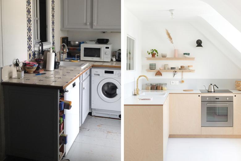
A smaller kitchen doesn't necessarily mean that you have to compromise on style. Think about how you can make the best use of your space and plan the cabinetry layout very carefully. While storage is important, it can easily dominate a space. Parisian architects, Hélène and Julien, from Heju overhauled this basic kitchen turning it into a minimal haven with clean lines and natural materials. The duo removed the crowded upper cabinets and opted for some floating plywood shelves instead. They finished the look with Smeg appliances — it's all in the details.
2. Replace cabinet fronts.
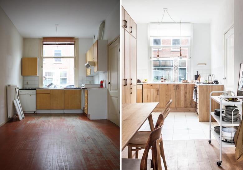
When Holly Marder of Avenue Lifestyle moved into her home, she was pretty sure of the potential lying in her rundown kitchen. A huge window was the starting point for a light-filled, open concept design with simple, natural details. After removing the upper cabinets, extractor fan, and exhaust pipe, Holly and her partner painted the walls bright white, replaced the sink and tap, and swapped the old cabinet doors with oak fronts from Koak Design. The finished result is full of warmth, texture, and an even lighter and brighter aesthetic.
3. Consider your appliances.
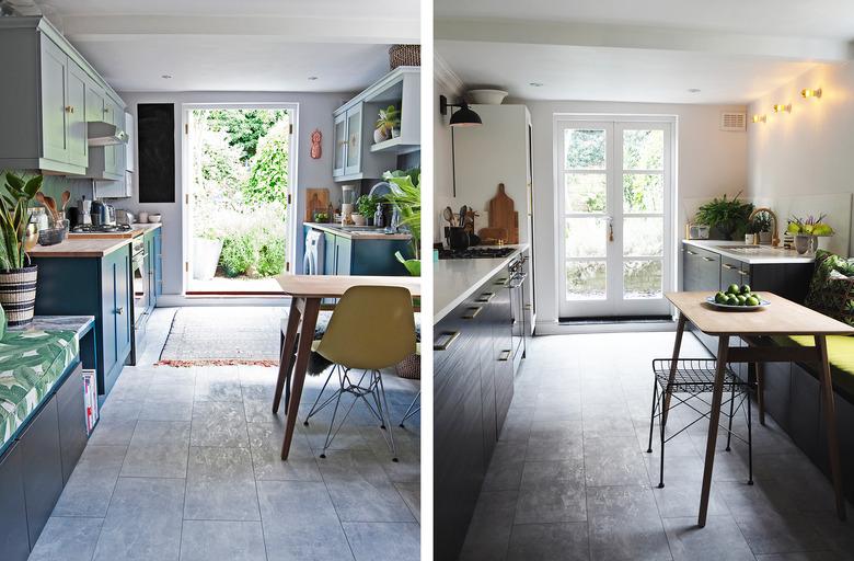
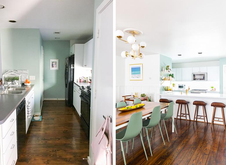
There's a theme going on here. In a bid to open up her kitchen, Bianca Hall of French for Pineapple removed the upper cabinetry and extended the lower cabinets to create a bigger and more light-filled space. If you are working with a short time frame, Bianca's kitchen makeover is a great reference since her space was completely overhauled in just one month (as part of blogger challenge Revamp Restyle Reveal). Her new appliances were carefully selected to blend in perfectly with the new cabinetry and the result is a much sleeker (and more expensive) look.
4. Choose light and bright colors.
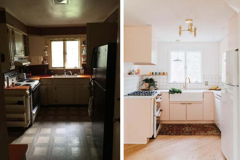
If you're struggling with a dark and dreary kitchen, it's best to opt for colors that will impart a more welcoming ambience. Just look at the difference between this kitchen makeover before and after! This home revamped by Chris and Claudia Beiler features Home Depot cabinets painted in Pink Ground by Farrow & Ball and concrete countertops made by Tyler Martin. The farmhouse sink, purchased on Amazon, and gold light fixture are the final touches to this elegant overhaul.
5. Don't underestimate less expensive options.
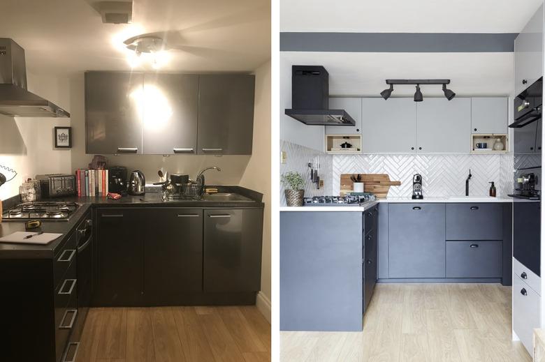
Just because everyone says kitchen makeovers are expensive, doesn't make it true. IKEA has great options for kitchen remodels and the results aren't quite as off-the-shelf as you might think. Athina Bluff of Topology Interiors renovated her rental kitchen with the help of IKEA's in-house design team and created a stylish yet practical area with more counter space, fully functioning high-tech appliances, and more storage.
6. Carefully consider all of the ways that you use your space.
Think about how you use your kitchen before you plan your layout. If you're entertainers, make like Ashley Rose of Sugar and Cloth and design a space that is ready for the masses. After extending the width of the island to be more suitable for bar stools, and giving it a waterfall countertop, this kitchen has gone from bland to glam. Take extra note: the modern white cabinets were given a simple refresh by replacing old hardware with simple brushed gold knobs.
7. Knock those walls down (if you really have to).
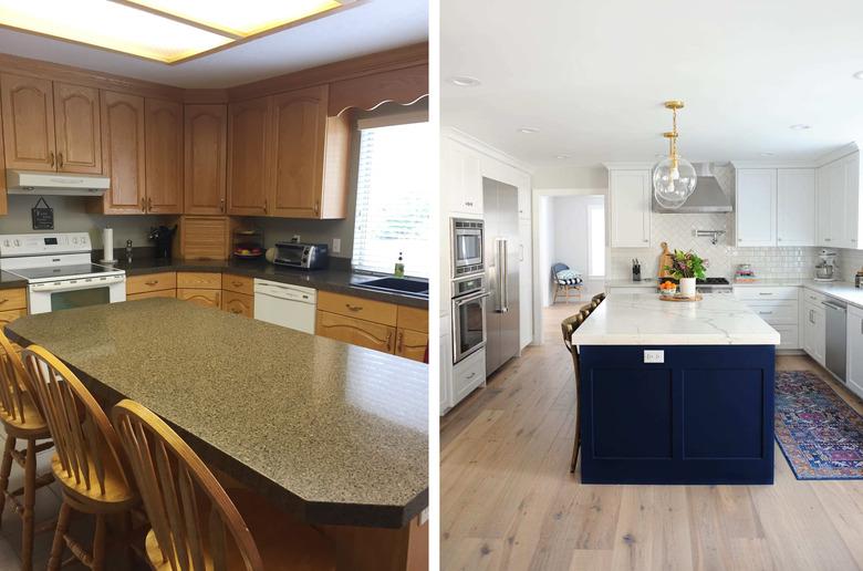
Oh, how we love it when a room looks completely unrecognizable after a transformation, and this kitchen makeover by Pink Peppermint Design does not disappoint. The formerly '80s-style house was cramped and poorly designed, so owner Tammy Mitchell removed the wall between the kitchen and living room to open up the area. She also added a navy island (definitely the pièce de résistance), white cabinetry, and marble countertops to create a high-end look that also oozes personality.
8. Go all-out on your countertops.
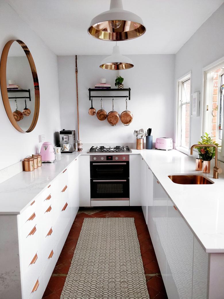
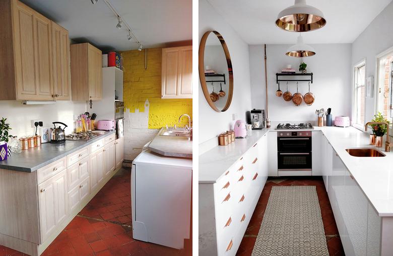
Another Revamp Restyle Reveal project that truly caught our eyes was this setup from Kat Williams of Rock n Roll Bride. The alternative magazine editor opted for a glossy white and copper theme with a dash of pink for good luck. The small space meant Kat wanted to keep it as simple as possible, so she chose to remove the upper cabinets, replacing them with a pot rack and huge copper-rimmed mirror to reflect the natural light. Caesarstone countertops take the look to the next level and add a final touch of glamour to the uber-chic space.
