The Color Choice HGTV's Nate Berkus Wishes People Would Stop Using In Their Homes

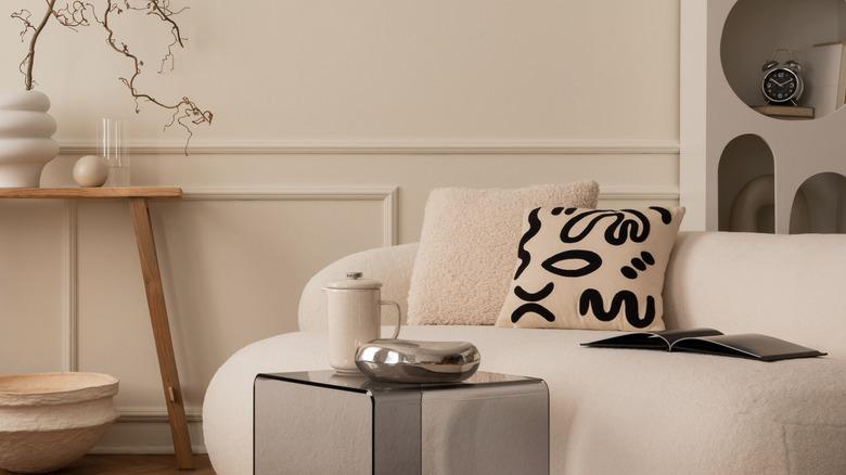
Interior designer and star of HGTV's "The Nate and Jeremiah Home Project," Nate Berkus has a name synonymous with magnificently chic, elevated, and intentional spaces. In order to create these iconic spaces, however, Berkus does not typically use an abundance of color. "We're very good at neutrals. I joke that they're like our love language," said Berkus' partner, fellow designer, and costar Jeremiah Brent in Domino. Truer words could not have been spoken, as one glance at the portfolios of Berkus, Brent, or a combined effort of both will instantly confirm that they are masters of creating impactful and showstopping spaces in layered, nuanced neutral color palettes.
Of all neutrals, beige is one of their timeless go-to paint colors for a sophisticated foundation in a space. However, Berkus emphasizes that picking the right beige paint color is essential, as not all beiges are created equal. Berkus particularly hates beiges with a yellow or green undertone, as these are likely to look dated rather than chic.
Sounds simple enough, right? Well, maybe for Berkus, who has a designer's eye for detecting subtle undertones. But for the average DIYer picking paint shades, beige can actually be one of the trickiest shades to get right. Why? Because there are actually beiges on the market with five — yes, five — different undertones: green (coolest), gold, yellow, orange, and pink (warmest). How's that for confusing?! So let's dive into the details of understanding how to determine a paint color's undertone, as well as pick the right beige for an updated, elegant space while avoiding outdated paint color trends that scream 1990s or early 2000s.
How to determine the undertone of your paint shade
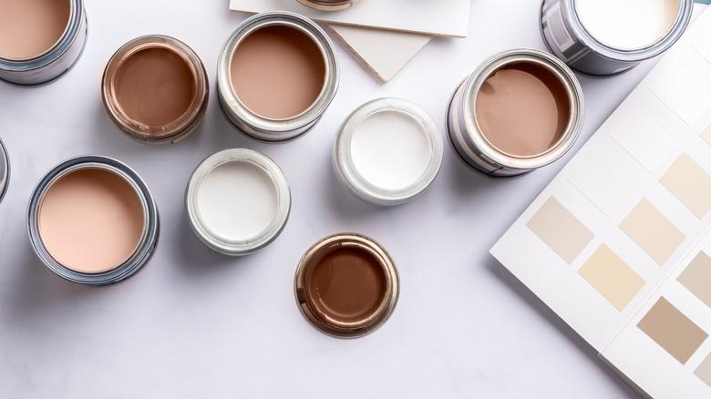
First of all, what exactly is an undertone? When paint is mixed together to form the array of shades you see at the hardware store, each one is made up of a meticulously calculated formula of different hues to achieve the final shade. It is these slight colors that can suddenly (and sometimes very unfortunately) appear when on the walls.
Undertones can be really tricky, especially since they can be hard to pinpoint on a small solo paint swatch. The trick to detecting your undertone before you spend ages and precious dollars painting the wrong color on all the walls is to put it next to a pure version of that color to see how it changes its appearance in comparison. With color wheel hues, black, or white, this is a piece of cake. Just use the color wheel. But with neutrals like gray, beige, and all of the greiges and taupes in between, it's harder to find a pure comparison.
Often, your best bet is to do three things. First, look further down on the same paint color strip to the darker shades to see if the undertones are more obvious (they usually are versus the more subtle light swatches.) The second is to compare your paint choice with alternate similar swatches to see if the side-by-side beige paint comparison makes the shade show its true colors. Lastly, compare the paint colors to the main finishes in your space to see if the undertones are complementary — or if the room finish, such as the flooring or countertops, brings out an inharmonious undertone.
Choosing the right beige paint color for your space
Following Nate Berkus' advice to avoid intense outdated beiges with strong green or yellow (or darker, muddier gold) undertones, it's best to look for light-toned beiges or creams with warmer undertones for a clean, timeless look. Opt for beige with soft pink undertones like a natural linen or a subtle orange base to complement similar finishes like brick or terracotta.
Alternatively, a "true" beige that feels more neutral will actually have subtle yellow undertones that may be a better fit for the finishes in your space. Because the yellow undertones are extremely soft, it won't look dated. Beiges with softer green undertones will tiptoe toward the greige spectrum. Berkus and Brent picked Even Better Beige by Behr as one of their favorite classic options – a neutral beige with subtle yellow undertones similar to Sherwin-Williams Accessible Beige.
For more of a soft brown rather than yellow-beige, pink-undertoned shades like Benjamin Moore's Lambskin and Sherwin-Williams' Shiitake are good starting points. A subtle orange undertone can begin with Benjamin Moore's Navajo White or the Sherwin-Williams Casa Blanca color. Once you have a solid contender or two, paint a large swatch on the wall in the room, because natural and artificial lighting have their own undertones that can alter the appearance of the shade. Watch your sample throughout the day to make sure the light doesn't bring out any undesirable hues. The next time you're choosing a gorgeous, classic beige paint color for your home, take valuable undertone advice from Nate Berkus. Avoid outdated strong undertones with yellow, gold, and green, and go for an updated shade instead.