The Best Neutral Paint Colors For Your Kitchen If You're Tired Of White
It will likely come as no surprise to you that the white-on-white-on-white kitchens ruling the roost over the past decade or so have taken a dip in popularity in recent years. This is mainly thanks to the often stark, sterile, generic pitfalls these forgettable whitewashed spaces often fall into when not properly balanced with enough contrast, texture, or color. Instead, people are gravitating toward warmer color palettes with a dash of personality to create spaces that feel welcoming and leave a lasting impression. So, what do you do if you have an all-white kitchen and are craving a change but don't have the budget or desire for a full remodel? The easiest way to give your kitchen a complete transformation without touching a sledgehammer is with a coat of paint, either on the walls or cabinets (or both!).
However, not every person wants a technicolor kitchen either, but thankfully, there are plenty of options for creating a neutral, calming kitchen while still branching off from the completely white look. I've compiled my favorite neutral non-white paint colors as an interior designer, as well as how I like to use each one, the type of vibes each one brings to your space, and specific paint swatches to use as a jumping off point. We will start with the beige, greige, gray spectrum, then move on to moodier dark shades and unexpected neutral non-neutrals that will look like a dream in your kitchen. As with all paint colors, be sure to paint a large swatch of your main contender(s) and watch it in the room's light throughout the day to be sure it works in your space. Without further ado, here are my nine favorite neutral paint colors to give your kitchen an elevated upgrade beyond plain white.
Beautiful beige creates warmth and sophistication on walls or cabinets
A warm step beyond white, a creamy beige is a beautiful option for cabinetry, walls, or both. Still light and airy, but with more depth and charm than plain white, beige is a stunning choice for softening the edges of a transitional, new traditional, or cottage kitchen. Try subtle hues like Sherwin-Williams Accessible Beige or Realist Beige, Benjamin Moore Creamy White, or Farrow & Ball's Dropcloth, but be sure to paint a large sample in the space to make sure you aren't seeing any funny undertones.
Light to medium neutral gray is a classic when complimented with warm accents
Gray is a classic kitchen color, but you want to avoid looking like a 2010s throwback with too many cool undertones. This is also why I usually avoid strictly painting the walls gray (gray walls with white cabinets has been DONE), but rather the cabinets only or the cabinets and walls together for a more elevated color wash. Pair a light to mid-tone neutral gray like Benjamin Moore Coventry Gray or Chelsea Gray with warm accents and complimentary finishes to create a balanced and updated color palette.
A balanced light greige tone is versatile and refined
Just to confuse things further, I absolutely love a gray shade with warm undertones, like if beige and gray had a nuanced, refined baby – thus the name 'greige.' This perfect in-between hue works in most design aesthetics, from modern to traditional thanks to its natural delicate balancing act between warm and cool. Gorgeous as greige cabinets, walls, or a color wash of both, look for sophisticated shades like Sherwin-Williams Repose Gray or Agreeable Gray, Magnolia Home Gatherings, and Benjamin Moore Revere Pewter or Balboa Mist.
Mid-tone to dark taupe shades a rich and impactful on walls or cabinetry
Take your love for greige a step darker and warmer and paint your kitchen in a stunning mid-tone or deep shade of mushroom taupe. Heavier on the brown-beige side of the greige spectrum, these taupe hues boast more contrast than their soft neutral counterparts for a ton of visual interest. Try samples like Benjamin Moore Pashmina, Farrow & Ball Mouse's Back, and Sherwin-Williams Sticks and Stones or Morris Room, but be sure to sample them in the space to avoid choosing a shade with heavy purple undertones.
Rich desaturated chocolate brown and bronze wood tones are incredibly chic
Brown is very hot right now, and for good reason – it looks incredibly lavish and refined when painted on kitchen cabinets! Gorgeous in a satin finish or extra luxe in high gloss, go for a rich desaturated chocolate brown, such as Benjamin Moore Char Brown or Sherwin-Williams Sable, or a darker Sherwin-Williams Urbane Bronze. Alternatively, natural or stained wood tones are another fantastic way to bring in brown tones with a humble, organic twist for cabinetry or wood accents.
Charcoal is an impactful yet soothing choice for contrasting cabinets
For an impactful pop of contrast but still softer than black, charcoal is a beautiful choice for painting kitchen cabinets. Shades like Sherwin-Williams Iron Ore, Behr Cracked Pepper, or Farrow & Ball Off-Black are sophisticated and bold, yet soothing and approachable. Super modern spaces could go with a matte or high gloss cabinetry finish, while others would look gorgeous in satin. Pair it with warm accents like brass fixtures and natural wood tones to balance out any cool undertones in the charcoal.
Classic black cabinetry adds a dramatic, moody luxury
If you are ready for some serious drama, head straight for black kitchen cabinets. With all of the class and refined luxury of a grand piano, black is a tried-and-true yet moody classic. I tend to never go any further than Sherwin-Williams Tricorn Black when it comes to black paint, but Sherwin-Williams Black Magic, Benjamin Moore Onxy, and Farrow & Ball Pitch Black are also great contenders. High-gloss finishes will add a luxe formal sheen, while satin is a surefire home-run – just be aware that matte black cabinetry surfaces can show fingerprints.
Beige-Muted soft beige-pink shades are the non-neutrals you never knew you needed
A muted beige pink is absolutely one of my favorite neutrals. While it looks incredible on walls or cabinets, it looks positively stunning on both together, creating a color-drenching effect in your kitchen. Choose a muted pink shade that looks close to a nude or beige tone and has natural peachy undertones to avoid the cutesy, feminine Barbie vibes of true pinks. Sherwin-Williams Artistic Taupe, Clare Paint Wing It, and Farrow & Ball Pink Ground or my personal favorite, Setting Plaster.
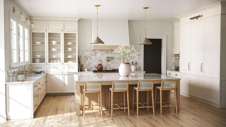
Muted gray-green sage hues are nature's neutrals
Muted green tones with a heavy hand of gray are truly the neutrals of the outdoors, so it's no surprise that when we bring them inside, they are the perfect organic neutral non-neutral. Look for gray tones with hearty green undertones for a very subtle sage look, like Pigeon by Farrow & Ball, or go more distinctly muted sage with a stunning mid-tone like Benjamin Moore Saybrook Sage or Oil Cloth, Sherwin-Williams Evergreen Fog, or Farrow & Ball's many amazing options such as French Gray, Castle Gray, or Mizzle.