11 Vibrant Colors That Go With Orange And Blue
Orange and blue are a naturally perfect pair. They are fire and water, yin and yang. As opposites on the color wheel, they are considered complementary, which means that when you put them next to each other, they enhance one another, making blues appear bluer and oranges, well, oranger.
That's why we humans are so dazzled by sunsets, with their washes of glowing oranges and blues. Courtnay Tartt Elias of Creative Tonic Design says she always thinks of sunsets when pairing these colors. She notes how the shades of a sunset can vary so much, "from brilliant oranges and blues all the way to pale tangerine and sky."
Any of these shades can work in a room design, from a bold electric blue living room with an orange sofa, to a quieter rust-wallpapered bedroom with pale blue headboards. The reason each combination works, however, is important to consider. Though orange and blue are complementary, it still takes an attention to undertones, balance, and scale to pair them successfully. Orange is particularly tricky because at its brightest it can be quite an attention hog if not offset effectively. Luckily, a couple of design rules can help you confidently pair these two vibrant colors.
How to Create Orange and Blue Color Schemes
First, match your orange and blue tonally to create balance in your room design. Think jewel tones with jewel tones, pastels with pastels. Second, decide which color will be more dominant in the space. The 60-30-10 rule is a classic in interior design for figuring out how to balance your color palette. The dominant color gets used for about 60% of the room (walls, large furniture, and/or rugs), the secondary color gets 30% (say, smaller furniture pieces, drapes, maybe an accent wall), and the accent gets 10% (throw pillows, wall art, etc.). Thinking about the vibe you want for your room can help you decide whether to go bright or muted, and whether to let the orange or blue dominate.
As for an accent color, Tartt Elias said this is a place to experiment, if you'd like. She loves looking to nature for inspiration, and sees green as an obvious choice. "Look outside," she said. "The sky is blue, the sun is orange, and grass is green." If they go together in nature, she argues, they'll work in your room.
Again, consider undertones as you choose your accent color — but don't be afraid to try an out-there choice. For example, if you've chosen jewel-toned blues and oranges, you could choose a tonally similar green, such as emerald, and play it safe. But according to Elias, you can also think about creating some visual tension. "It might be fun to splash [on] some lime ... Not everything has to match."
Check out these 11 examples of color combinations for orange and blue that are beautifully balanced.
11 Color Combinations for Orange and Blue
1. Orange, Electric Blue, and Pink
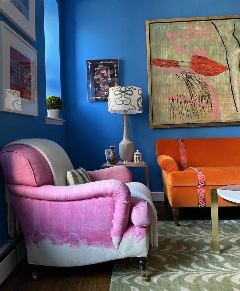
In this room by Courtney McLeod of Right Meets Left Interior Design, bright, saturated color creates a joyful, energetic vibe. McLeod went big with the electric blue wall paint, then complemented it with an orange sofa and bubble gum pink chair. More muted touches, like the dark hardwood flooring and sage green rug, help ground the room.
Blue and yellow are a classic pair. In this baby's room by J and J Design, these colors play particularly well together with orange. An orange bird print gives the soothing peacock blue wallpaper a whimsical touch. Meanwhile, the bright yellow rug provides the perfect happy pop of color.
Incorporating richer shades of orange and blue doesn't have to result in a moody, dark space. Notice here how designer Neelam Gurm offsets the darkening effects of a deep navy sofa, patterned terra cotta rug, and brown accents with the help of abundant natural light and a high white wall.
Although orange gets a bad rap for being hard to work with, this room shows how beautifully versatile it can be. This subdued, rusty shade is calm enough for a bedroom backdrop, especially when paired with cream and earth-toned accents. The pale blue headboards provide the perfect cool complement.
Balance playful orange and blue with a splash of gray. In this kitchen by Justina Blakeney, pearl gray cabinets ground a colorful palette. Their purple undertone keeps them from looking too somber for the space, and the sunburst-patterned tile backsplash provides the perfect transition into the bright papaya-colored upper walls.
There's a lovely balance to this room by designer Shea McGee of Studio McGee. The slate blue cabinetry dominates the space, creating a sophisticated and moody effect, while the white walls bring in some lightness. Orange chair cushions provide a pop of warmth and brightness, while black pendant lights ground the color palette.
Here, again, is this lovely powder room designed by Courtnay Tartt Elias. The sweet sherbet-colored vanity plays perfectly off of the wallpaper in pastel blue-green, orange, yellow, and white. Notice how the marble tile and white ceiling provide some rest for the eye, preventing any sense overwhelm. For a more saturated take on this color pairing, combine teal with a bright orange, like tangerine.
It's hard to resist a moody blue. In this space, designer Ann Lowengart chooses a rich shade, then layers on texture and pattern, pops of red and orange for warmth, and gold accents for shine and sophistication. The wood paneling creates a sense of formality that could make the room feel cold were it not for elements like a lit fireplace and upholstered seating inviting us to settle in.
Kelly Wearstler is a legend for a reason. The Peacock Bar, pictured here, is all the proof we need. The high-level pattern play at work in this space is indeed masterful. But at its heart, what Wearstler is working with is a simple color palette of red-oranges, deep blues, and wood tones that you could translate into your own vibrant kitchen or dining room.
Lavender with peach and blue? In a living room? It's not an obvious choice. But Madre Dallas Design makes it sing. You'll recall the old trick of keeping your whole color scheme unified with a consistent tint or tone — in this case, pastel. Meanwhile, the traditional Hollywood Regency aesthetic and formal furniture placement help give the sugary palette a refined vibe.
Crisp, clean, and preppy is how we'd describe this coastal space by Blakely Interior Design. Bright white plays down the bright Kelly green ceilings and subtly patterned primary blue rug, while orange piping, accent pillows, and flowers are layered as warm accents. The overall feeling is that of a fresh summer's morning. Grab your flip flops and head out to catch some rays.
Colors That Go With Orange and Blue
To recap, orange and blue go together like the best of friends. They complement each other's differences, and elevate one another, as demonstrated in this living room by Sabbe Interior Design. Bring in accent colors to enhance the party and neutrals to make sure it doesn't get too rowdy. (Especially if you're using bolder shades, you'll want to bring in other colors to give the eye a needed break.) Here's our list of colors that pair well with orange and blue:
- Pink
- Yellow
- Brown
- Cream
- Gray
- Black
- White
- Gold
- Wood Tones
- Lavender
- Kelly Green


