9 Outdated Wall Art Trends, According To Designers
You can always rely on wall art to personalize your space. This is true even if you're a renter, as art can instantly transform your home without a ton of commitment. The only catch? It can be easy to fall into the trap of outdated wall art trends, especially if you're overwhelmed by all the choices.
Of course, art is extremely personal, and at the end of the day, you like what you like. But if you want to create a timeless look while avoiding old wall art trends, consider avoiding the following styles, as noted by designers.
1. Avoid pop art. Add abstraction.
1. Avoid pop art. Add abstraction.
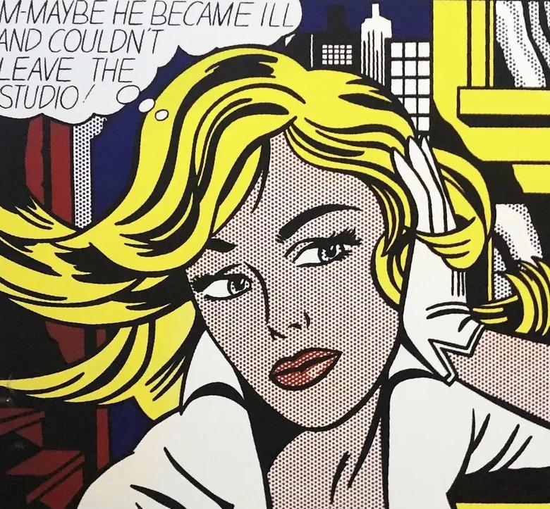
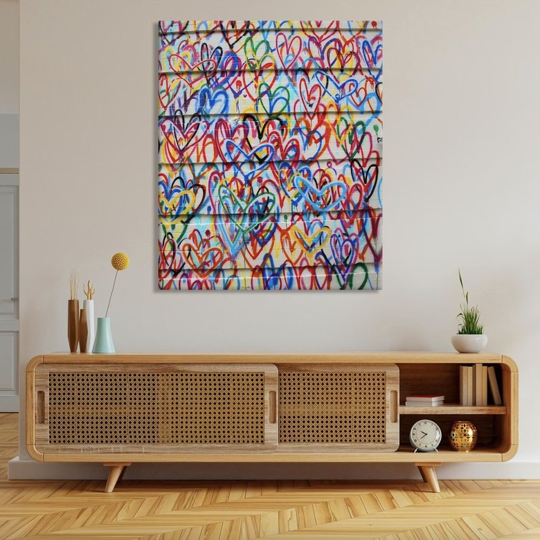
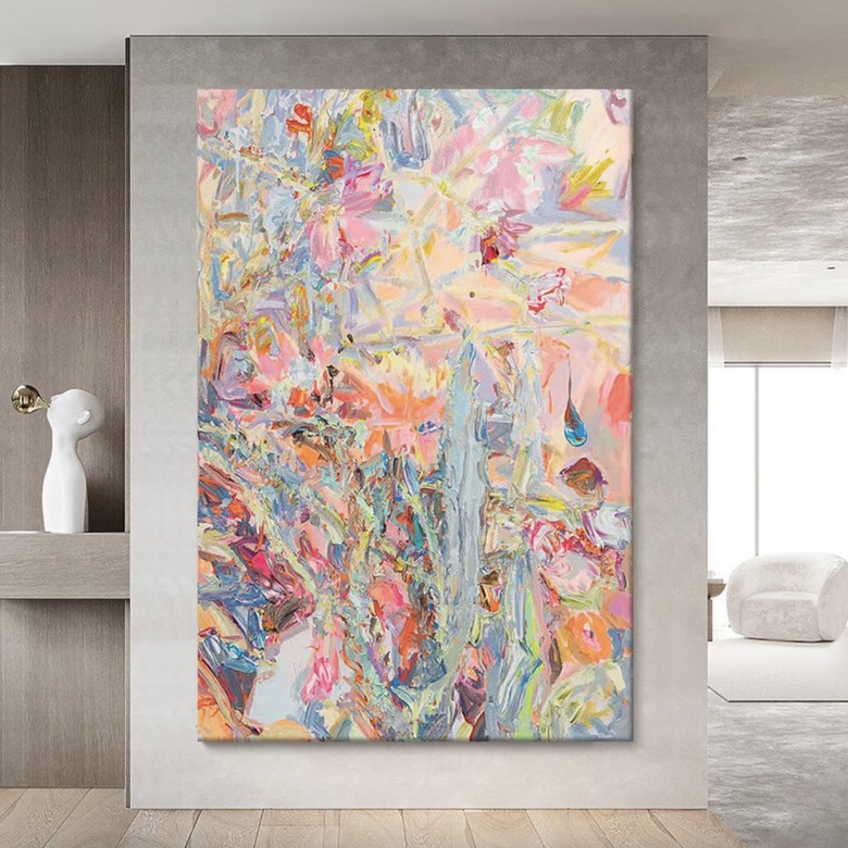
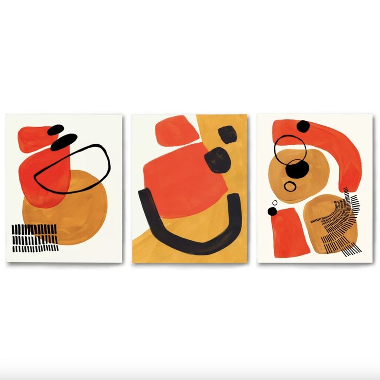
"Though pop art is still around and has its fans, people are gravitating toward more street and graffiti artwork for their spaces," Linda Hayslett, interior designer and founder of LH.Designs, tells Hunker. "It's the next generation of pop art, as [it] feels a bit grittier and less commercial." But if graffiti is too adventurous or perhaps doesn't fit with your design scheme, consider an abstract piece that can add color and interest to a blank wall.
2. Avoid generic travel photography. Add personal touches.
2. Avoid generic travel photography. Add personal touches.
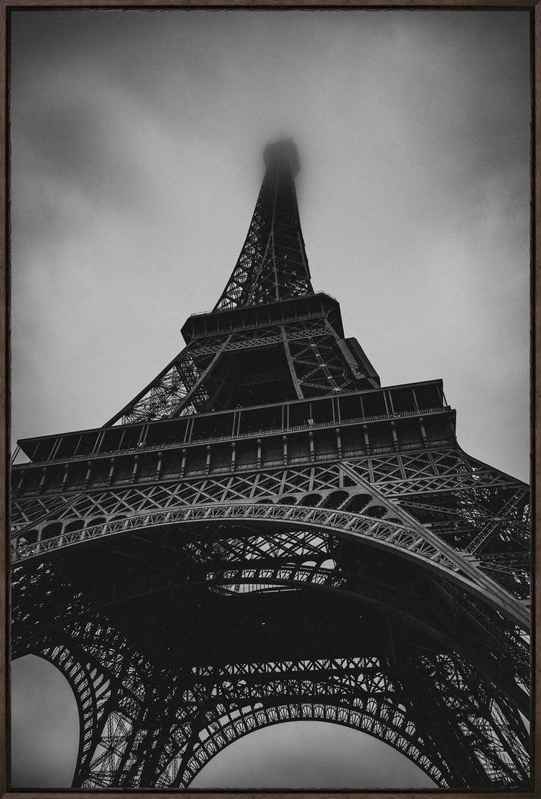
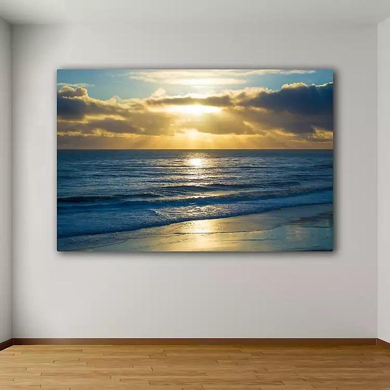
According to Tara Miller, interior designer and founder of The Heartland Interior Design, one wall art trend that's on the way out is displaying generic images of places you've never been. The approach, after all, lacks both personality and authenticity. "Instead, frame photos you've taken on your travels," suggests Miller, adding, "This is not only more genuine but [the photos also double as] great conversation pieces when you have company over."
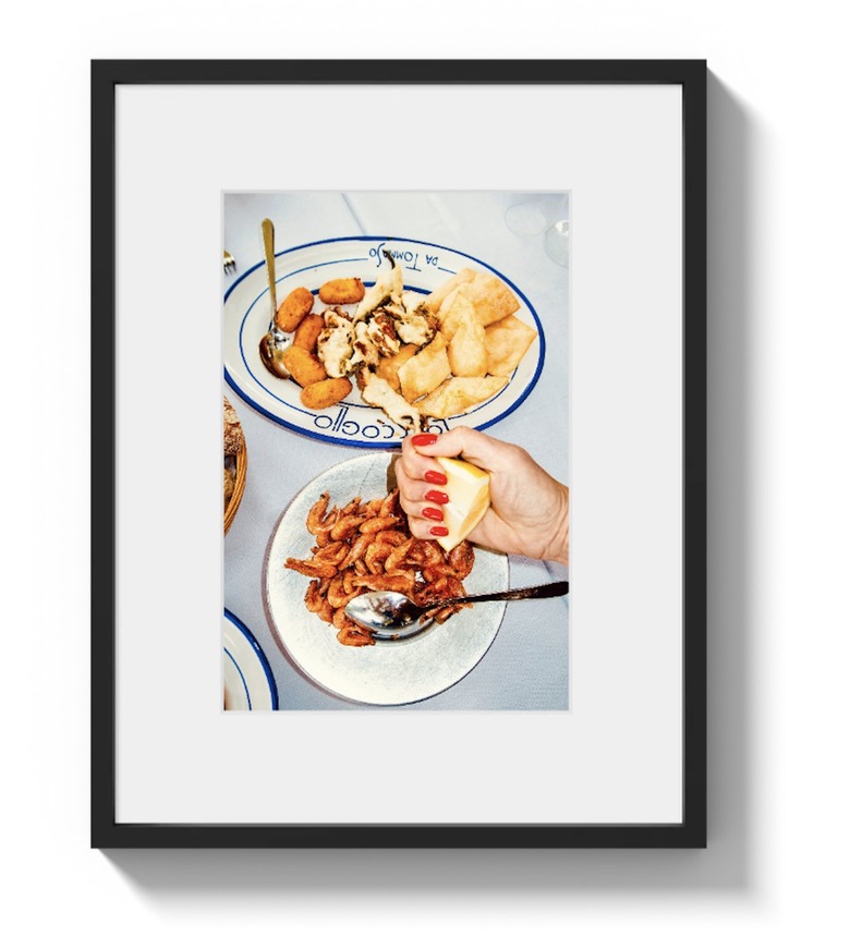
But if you haven't been able to travel lately — or maybe aren't the world's best photographer — you could always opt for imagery that at least looks more personal. House of Spoils offers a variety of wall art from around the world, focusing on the small pleasures of travel, from poolside drinks to Italian dinners, that look like they could have come straight from your Instagram grid.
3. Avoid gallery walls. Add oversize prints.
3. Avoid gallery walls. Add oversize prints.
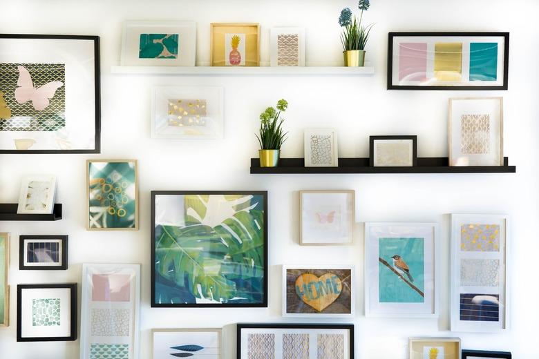
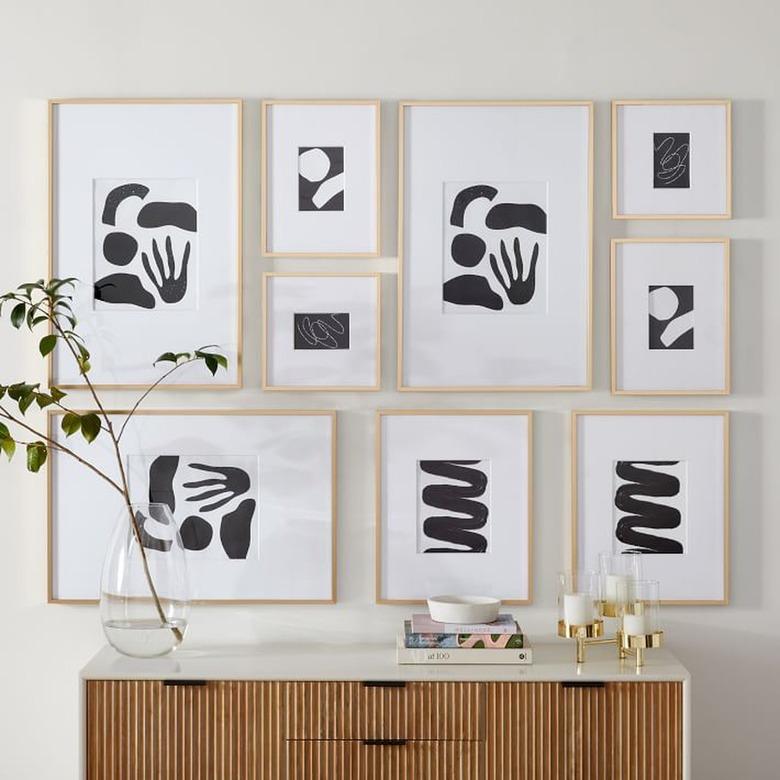
Once upon a time, gallery walls were the most popular way to adorn a space. But according to Sherica Maynard, interior designer at Interior Design by S&S, those days are over. "Gallery walls are starting to fade away," she tells Hunker. Instead, Maynard says that people are shifting toward oversize and large-scale artwork and prints for a more contemporary look.
4. Avoid fine art portraits. Add something silly.
4. Avoid fine art portraits. Add something silly.
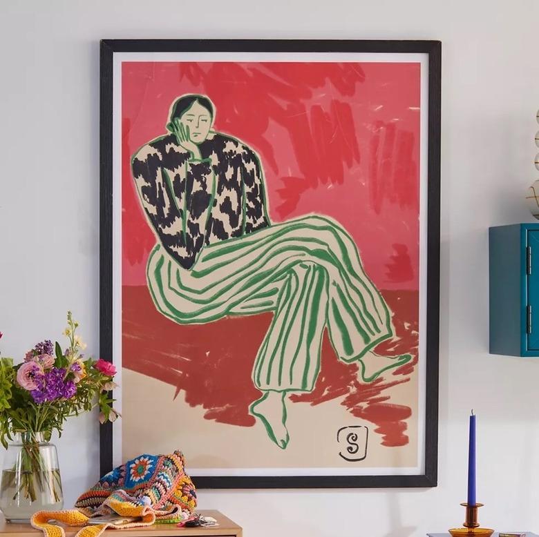
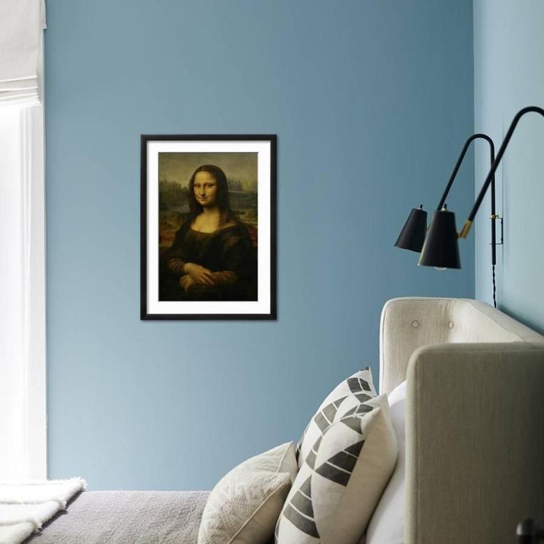
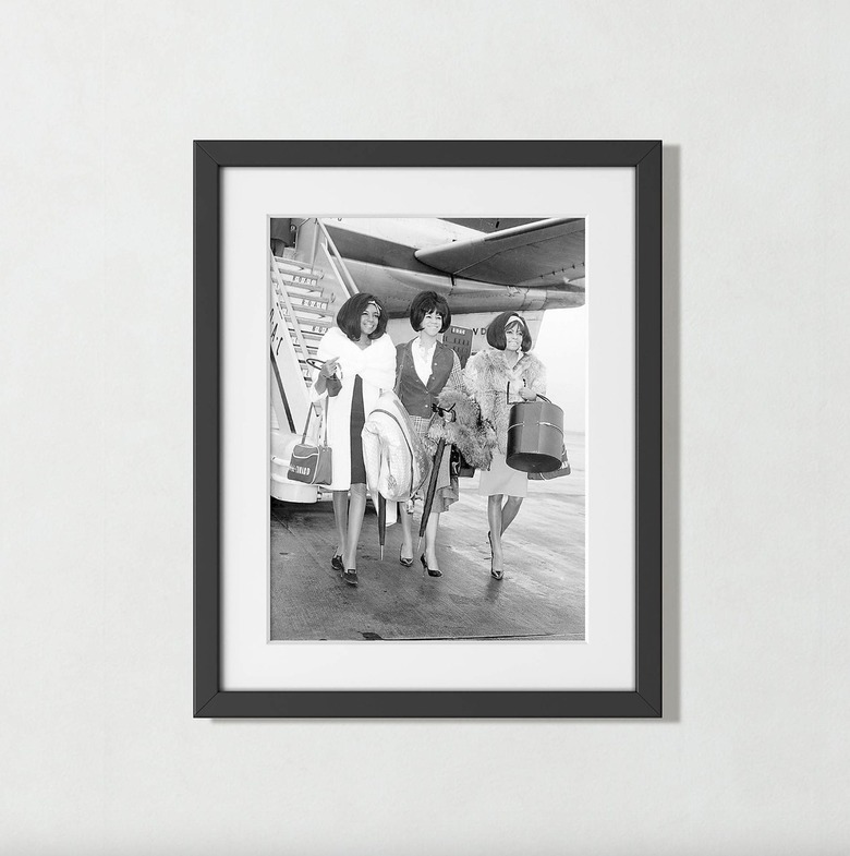
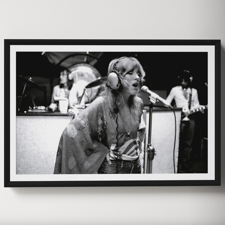
"Fine art portraits have always conveyed how the past was serious and refined, but we never see artwork showing the more silly or fun side of people back then," Hayslett tells Hunker. Rather than framing a lifeless portrait from the past, opt for prints of more recent history that showcase the subjects' personality.
5. Avoid unframed canvas pieces. Add (duh) a frame.
5. Avoid unframed canvas pieces. Add (duh) a frame.
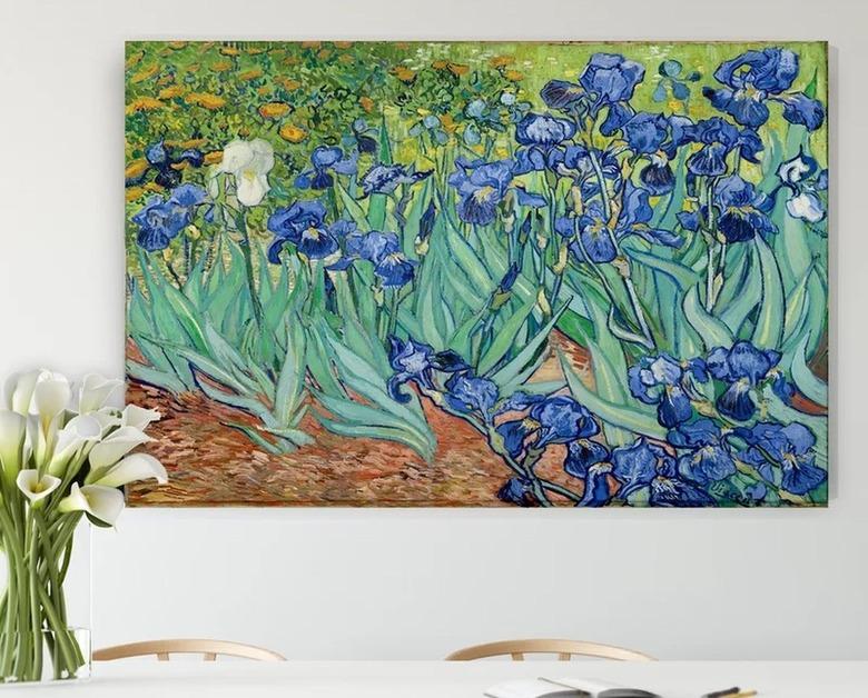
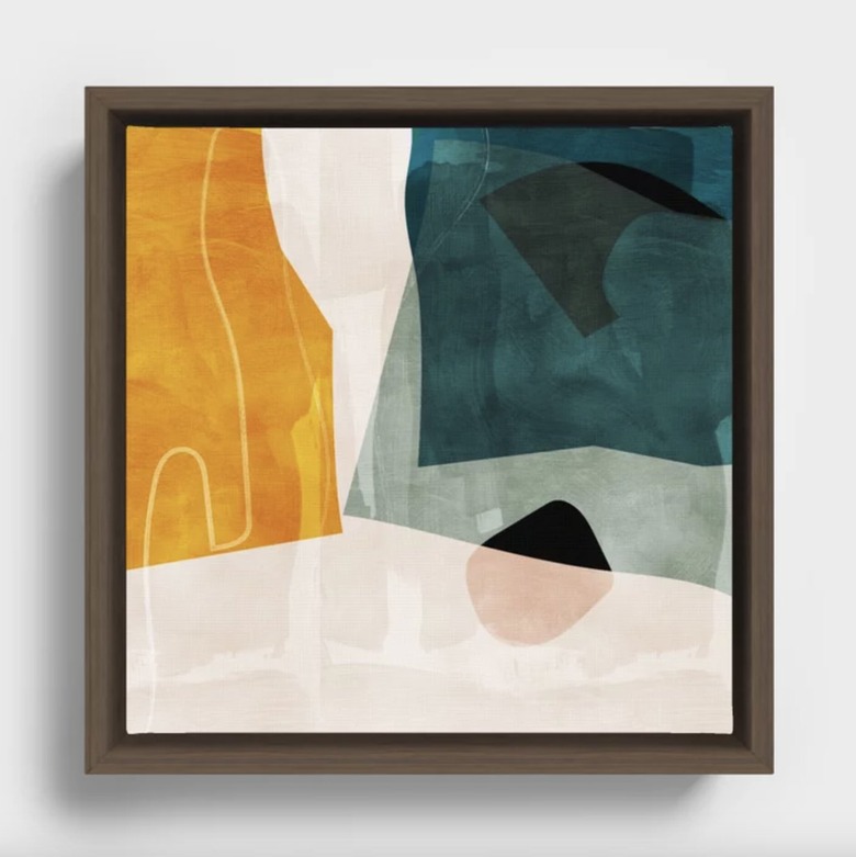
According to Yoselin Castro, senior interior designer at Mackenzie Collier Interiors, canvas art pieces with frameless borders are going out of style. Now, people are leaning toward displaying those pieces in wood or metal frames, she says. Wooden options are especially popular, as they "come in an array of finishes and bring a lighthearted feel to walls," Castro tells Hunker.
If you are still all about canvas wall art but want to adapt this more modern take, look toward Society6, which has an entire section dedicated to framed canvas pieces. There, you can choose from a number of different frames, including wooden options.
6. Avoid flat art. Add pieces with depth.
6. Avoid flat art. Add pieces with depth.
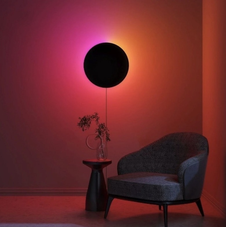
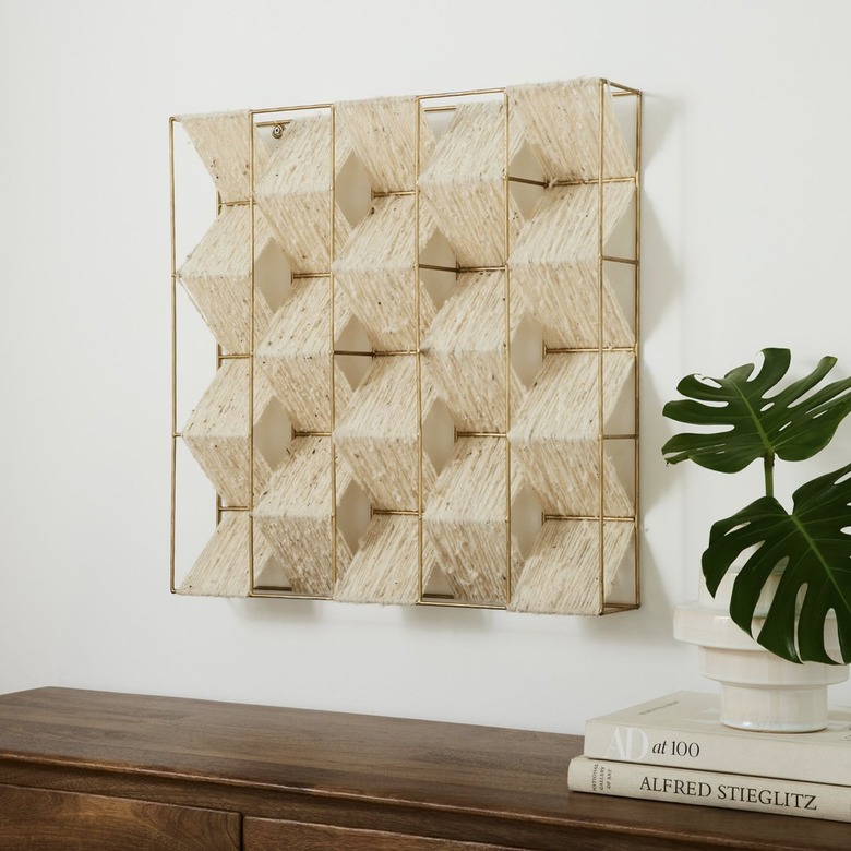
Thanks to the rapid growth of technology, more people are craving interaction with art, shares Hayslett. As a result, flat pieces of artwork are being "replaced with three-dimensional pieces that are more interactive or can change depending on lighting," she tells Hunker. Ultimately, she explains that "people are gravitating toward more artwork that changes with their mood as opposed to seeing a piece that stays the same mood all the time." Because wall art isn't just paintings and photography, we'd recommend looking into unique light fixtures that can add depth and personality to your space.
7. Avoid simple macrame. Add intricacy.
7. Avoid simple macrame. Add intricacy.
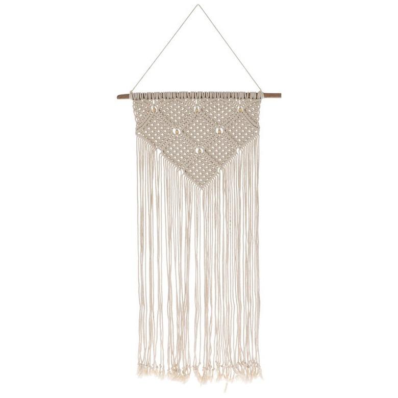
"Traditional cotton macrame wall hanging pieces are not as popular [since] the original design has evolved significantly over the years," Castro tells Hunker. As a result, "macrame pieces are being replaced with different versions of the traditional concept," she explains. "Skilled artists are constantly inventing designs and [discovering] ways to set their pieces apart, whether it be with more complex knots or dyes that give the traditional naturally colored macrame a fun twist."
8. Avoid 'telling.' Add 'showing.'
8. Avoid 'telling.' Add 'showing.'
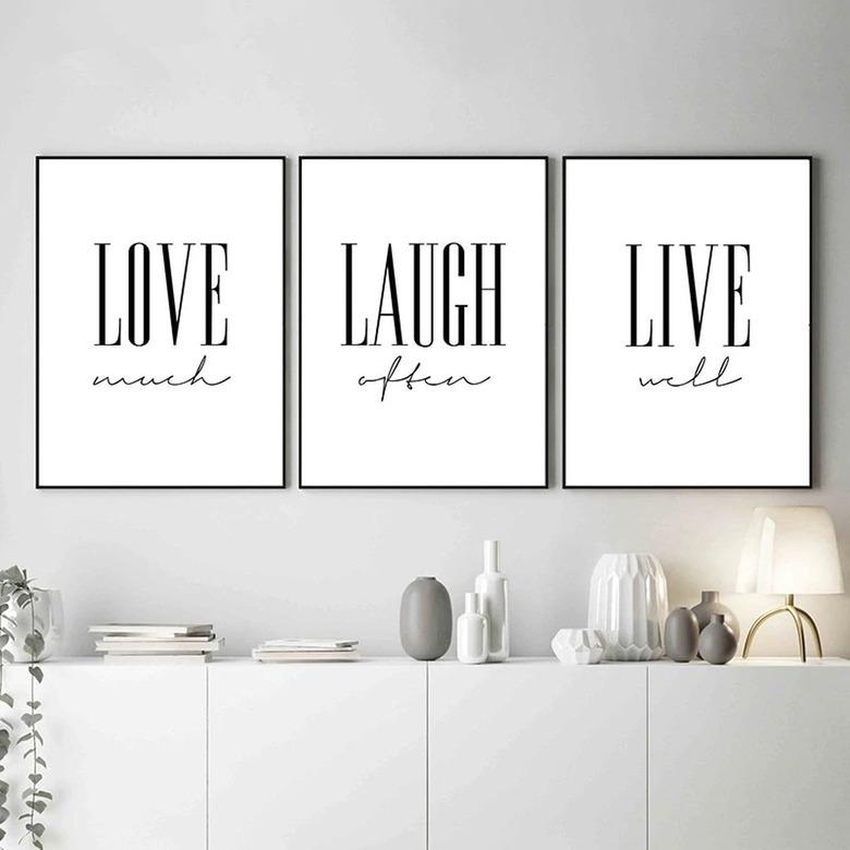
This one is so obsolete that it was called out by multiple designers. Consider this: A few years ago, lettering art was all the rage in many homes, from farmhouse to modern styles, explains Karen Rohr, interior designer at Mackenzie Collier Interiors. But due to its extreme popularity, the lettering style lacked both personality and intentionality, she says. Hayslett echoes this sentiment, adding that the look "says we're just filling up space to fill up space."
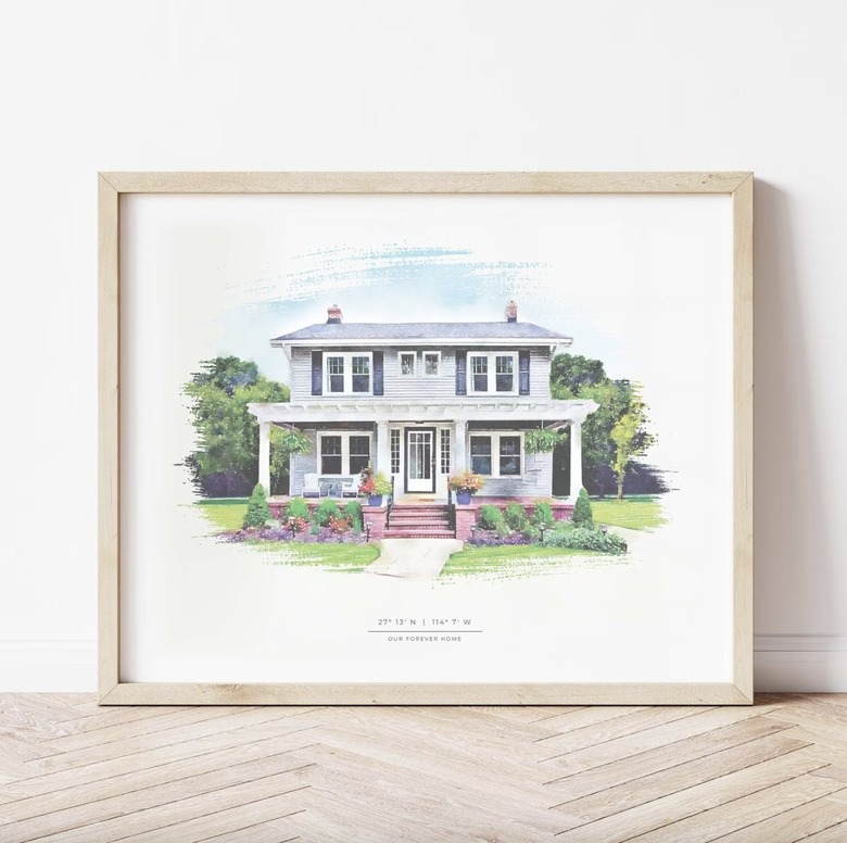
Instead of displaying cliché quotes, Hayslett recommends replacing the words with actual artwork that could reflect those words (the classic "show, don't tell"). For example, "a cool hand drawing of your actual home by a local artist can convey 'home sweet home' without spelling [it] out," notes Hayslett. Similarly, instead of hanging up a "live, laugh, love" sign, Miller suggests going for a watercolor landscape. "The natural colors and relaxing image will make you feel more at ease than black and white text in all caps."
9. Avoid themes. Add color cohesion.
9. Avoid themes. Add color cohesion.
Like specific elements or pieces, decorating techniques that involve wall art can also phase out. One such example is theme-based decorating, or filling your home with pieces related to a specific theme, like the beach or country, says Rohr. "While this can be fun in moderation, it's important to not go overboard or make it too obvious," Rohr tells Hunker. Otherwise, your personality can get lost in the details.
Rather than opting for a hyperspecific theme, consider sticking to a color palette. This gives you the cohesion you crave with the liberty to have fun. And if you don't feel like you have the eye for that, a number of stores make it easy with sets of complementing pieces.
