This 19th Century Italian Apartment's Modern Interior Is All Kinds Of Wow
Turin, located in northern Italy, is known for its food (but honestly, isn't all of Italy?) and also for its architectural grace: The streets are filled with refined and elegant baroque and neo-classical buildings. So you can imagine that any renovation project there would be a delicate endeavor. For architects Andrea Marcante and Adelaide Testa, approaching a sad 19th century apartment meant rewriting its history. Unfortunately, the home, although it was in a historic building, had been stripped of any original details by previous owners.
So the goal of the refurbishment developed into a reinterpretation of the past with a patina that was all modern (the name of the project is in fact "History Repeating"). The architectural studio went to great lengths to change the perception of space by rearranging rooms, enlarging the windows, and creating metal frames that extend out in lieu of walls to create boundaries without sacrificing natural light.
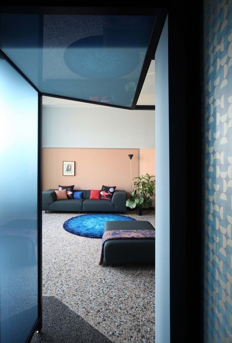
1. Living Room
Terrazzo floors — often found in traditional Italian homes — got a modern update with interesting color contrasts and inlays. A round, vintage 1970s rug adds a pop of blue and stands out from the living room's angular aesthetic.
2. Living Room
Much of the interior was designed around existing furnishings already owned by the clients. A sofa and pouf from Cassina stand out among pastel paint colors.
3. Kitchen
Kitchen furniture, designed by the firm, features a mix of materials including teak, metal, brass laminate, and lacquered wood.
4. Kitchen
Black borders are a theme throughout the home, helping to mark and anchor open spaces.
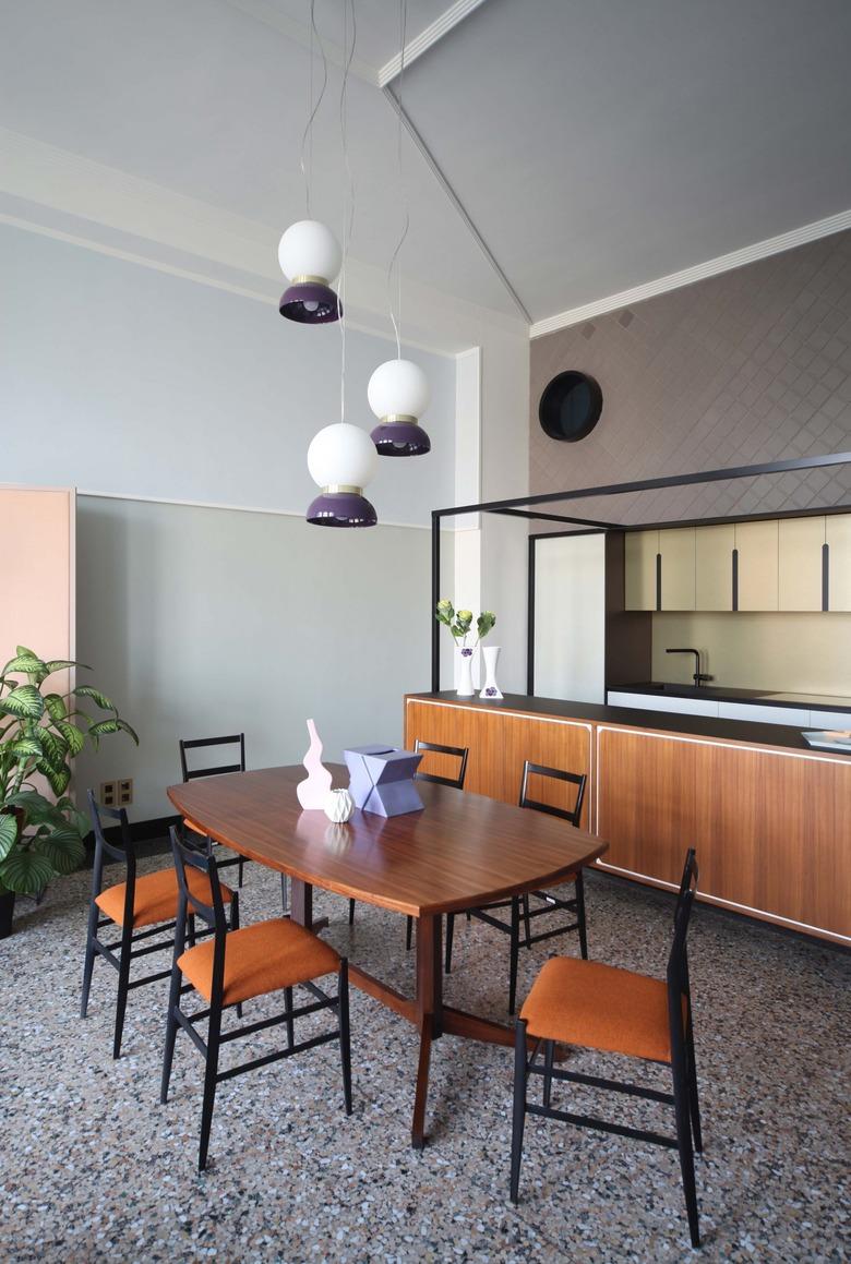
5. Dining Room
A dining table by Albini with Superleggera chairs by Gio Ponti is adorned with vases by Alessandro Mendini and Ettore Sottsass for Cedit.
6. Dining Room
The dining area combines midcentury and art nouveau vibes.
7. Bedroom
The bedroom is another example of where traditional meets modern thanks to wood herringbone floors that mesh with more recent additions like a skylight.
8. Bathroom
The small windows of the building's facade allowed the team to place the more private rooms (bedrooms and bathrooms) toward the outside street and still maintain a level of privacy for the clients. The bathroom cabinets were custom designed by the firm.
9. Bathroom
This bathroom is a reminder to never be afraid to mix colors — there are at least six different shades at work here.
10. Bathroom
Blue glass partitions were a clever way to bring privacy to the home, contributing to the new and modern story the architects constructed.


