L.A.'s Bardonna Restaurant Makes A Stunning Case For Spanish Style
When designer Matt Winter was conceiving his latest project, Bardonna in Los Angeles's Silver Lake neighborhood, he wasn't thinking about being on the cutting edge. In fact, his thought process drifted to the exact opposite approach: he wanted a haven devoted to the Old World. "This place would be a cool little joint where Picasso would hang his paintings before he was famous," the designer mused about the eatery, which opened earlier this year. The cafe was intended to be intimate, and Winter heightens the confined property with warm Spanish-inspired accents like intricate tiling, exposed beams, and uneven plaster to make the space feel cozily distinct from its trendy locale. But despite the design's lean toward traditionalism, a few modern and classic touches — like millennial pink cushions and gold sconces — keep the decor from feeling too much like a time capsule. It's a timeless and casually sophisticated look that feels artfully rebellious given its young age.
1. Exterior
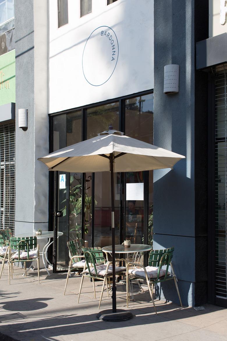
The majority of Bardonna's decor is either vintage or custom made. These outdoor chairs are from the 1960s and feature cushions from World Market.
2. Seating Area
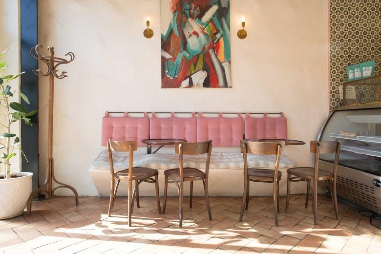
"When I was in Spain," Winter recounts, "I was walking on a street in a little village... and saw a gorgeous bench built into the side of someone's house with a hanging cushion." Now that memory is showcased at the restaurant's entrance, in a very of-the-moment shade of pink.
3. Counter
Winter decided to use the space's California charm by removing the plaster ceiling to reveal the building's original wood beams. He also layered uneven plaster on the walls to give the space a more organic feel. Trying it at home will take patience: "[The wall treatment] took a couple of times. The steps are easy but getting it right is hard," he said.
4. Dining Area
The custom swivel tables attached to the wall are relatively small, encouraging intimate gatherings over coffee and a sense of fluid community within the space.
5. Tiling
The tiling ties into the restaurant's Spanish theme, and covers a large portion of the restaurant. This patterned option was handmade and imported from Mexico, and then paired with modern gold shelving.


